
How to photograph your artwork properly
A repeatable studio setup, the measurements that matter, and the few facts worth writing down before a work leaves the room.
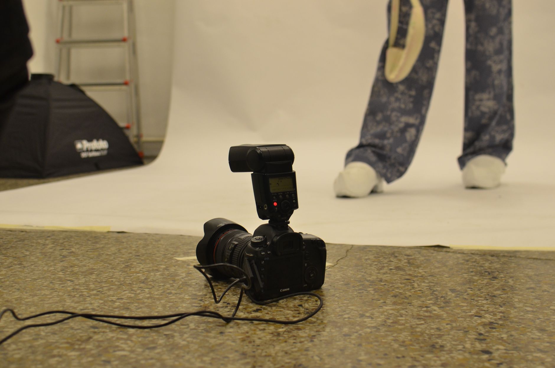
Light the work evenly from both sides at roughly 45 degrees, put the camera flat on at the centre of the piece, take the glass off if you can, include a colour target in the first frame and shoot in RAW. Keep the full resolution file. Everything after that is cropping.
What do you actually need to own?
A camera you can set manually, a tripod, two lights of the same make, and a colour target. That is the whole list. Nothing on it needs to be expensive, and once it is set up in a corner of the studio it stays set up, which is the part that matters.
The tripod does two jobs. It holds the camera still, and it holds the camera in the same place for the next work, and the one after that. A room where you can photograph a painting in four minutes is a room where you will actually do it.
A phone can produce a usable image, but it fights you. The lens distorts at close range and the automatic processing brightens shadows, sharpens edges and lifts saturation before you ever see the file. If a phone is what you have, turn on its RAW or ProRAW setting, stand further back than feels natural, and accept that you are making a good record rather than a reproduction.
What lighting is best for photographing paintings?
Two lights of equal output, placed at equal distance on either side of the work, angled at about 45 degrees to its surface and set at the height of its centre. At that angle the light bounces away from the lens instead of back into it, which is what kills glare on varnish and oil.
Daylight balanced continuous LED panels are the easiest thing to learn on, because you can see the result on the wall before you press anything. Window light works for flat, matte work if the window faces away from direct sun and you bounce a white board back from the other side. It drifts across an hour, though, so a session that starts accurate rarely ends that way.
Two quick tests for evenness. Hold a pencil upright against the centre of the work: the two shadows should be the same length and the same darkness. Then photograph the empty wall where the work will hang and look at the histogram, the graph your camera shows of how light is distributed across the frame. A single narrow spike means the wall is lit evenly. A wide smear means one side is hotter than the other.
Turn the room lights off. Mixing a tungsten bulb with a daylight panel gives you two colour temperatures in one file, and no amount of correcting afterwards fixes both at once.
The 45 degree setup is designed to suppress texture, which is right for colour accuracy and wrong for impasto. So take a second frame in raking light, meaning a single light placed low and far to one side so it skims across the surface at a shallow angle. Every ridge, dent, crack and warp throws a shadow. Conservators use raking light to document condition, and it is the single most useful frame you can take of a heavily worked surface.
How do you photograph work behind glass?
Take the glass out. Everything else is a compromise, and unframing a work for ten minutes is almost always less effort than fighting a reflection.
When the glass cannot come out, the professional answer is cross-polarisation: a polarising filter over each light and a third on the lens, with the lens filter rotated until the reflections drop away. It works on glass, varnish and wet-looking acrylic. It costs you around two stops of light, and it can deepen colours slightly, so photograph your colour target through the same filtered setup rather than trusting a reading taken without it.
The cheap version works surprisingly well. Darken the room, cover anything pale, wear dark clothes, and cut a lens-sized hole in a large sheet of black card held in front of the camera. The glass then reflects the card, and the card is nothing.
Do not solve a reflection by shooting from an angle. The work will lean in the frame, the parallel edges will converge, and correcting that in software stretches pixels and quietly falsifies the proportions of the piece.
How do you get the colour right?
Shoot RAW, the unprocessed data straight off the sensor, which lets you set white balance after the fact instead of guessing before it. Then put a colour target, a printed chart of patches whose values are known and standardised, in the first frame of every session, lit exactly as the work is lit. Take that frame, remove the target, photograph the work.
In editing, use the eyedropper on the neutral grey patch of that first frame and apply the same correction to everything shot under the same lights. This takes about fifteen seconds and does more for accuracy than any amount of eyeballing.
Then do the thing software cannot do. Put the work next to the screen, under the studio lights, and look at both. You know what the cadmium is supposed to look like.
What resolution do galleries want?
It varies, and every institution publishes its own requirement, so ask the person requesting the file. What you can control is keeping one master large enough that any request can be filled from it.
A note on the unit, because it confuses almost everyone. PPI, pixels per inch, is not a property of a file. It is a ratio between the file's pixel dimensions and the size at which it will be printed. A request for "300 ppi" means nothing until you know the print size. Full page A4 at 300 ppi is 2,480 by 3,508 pixels. That is the real number to check against.
| File | What it is | Where it goes |
|---|---|---|
| Archive master | RAW plus a 16-bit TIFF at full sensor resolution, no sharpening, no crop beyond the work's edges | Your own storage, kept forever |
| Print delivery | TIFF or high quality JPEG, sized to at least 300 ppi at the intended print dimensions | Catalogues, press, art fair applications |
| Submission | JPEG, sRGB colour profile, around 3,000 pixels on the long edge | Open calls, gallery submissions, residencies |
| Web | JPEG, sRGB, 1,500 to 2,000 pixels on the long edge | Your site, newsletters, social |
If you want a benchmark beyond your own judgement, the Federal Agencies Digital Guidelines Initiative publishes a star rating system for cultural heritage imaging, one to four, with four the most exacting. The Dutch Metamorfoze programme does something similar across three tiers. Neither is written for artists, and meeting them is not the goal. They are useful as a reminder that image quality is measurable rather than a matter of taste.
Which frames should you take of every work?
Once the lights are set, this takes a few minutes per piece.
- The colour target, lit as the work will be lit.
- The work, straight on, filling the frame with a thin margin of neutral background. Edges parallel to the edges of the photograph.
- The same view framed, if it will be shown or sold framed.
- Raking light across the full surface.
- The signature, date or any inscription, close.
- One surface detail at full resolution, somewhere the material does something interesting.
- The verso, meaning the back: stretcher bars, panel, labels, stamps, your own notes.
- The edge, for anything with depth.
- The work on a wall, with a floor and a doorway or chair in shot, so a stranger understands its scale.
Frames seven and nine are the ones artists skip and later wish they had. A photograph of the back of a canvas, with its stretcher and whatever you wrote on it, is the beginning of that work's provenance, the documented record of where a piece has been and who has owned it.
How should you measure it?
Height, then width, then depth. That is the order used in catalogues, auction records and almost every submission form, and a stranger reading your figures will assume it. Choose centimetres or millimetres and never mix them within a record.
Measure the work itself, unframed. If it will live in its frame, record both sets of figures and label which is which. For anything behind a mount or inside a rebate, note the sight size as well, meaning the portion of the work actually visible inside the frame or window.
Works on paper get the sheet size. If it is a print, add the image size, and the edition in the standard form, so 3 of 25 written as 3/25. Shaped, irregular or multi-part works get the greatest height and greatest width, with a line saying the piece is irregular and how the parts relate.
Then measure once more before you walk away. The dimension you half-remember three years later is never the dimension.
What do you write down while the work is still in front of you?
Eight things, and they take less time to record than to re-establish later: title, year, medium and support in your own words rather than a dropdown's, dimensions, edition if there is one, where the signature is, orientation, and where the work physically is right now.
Describe the materials the way you would to another artist. "Oil, sand and rabbit skin glue on unprimed linen" is a better record than "mixed media", and it is the line a conservator will want in forty years.
Mark the top on the back in pencil for anything that could plausibly hang two ways. Decide once whether your date means started or finished, and apply the same rule to everything. A full field list and the order to work through it sits in how to catalogue your artwork.
Where should the files and the facts live?
Together, in one place, backed up in three.
The convention borrowed from archivists is three copies of everything, on two different kinds of storage, with one of them somewhere other than the studio. A hard drive in a building with white spirit in it is not a backup strategy.
Name files so they sort themselves and survive being emailed to someone who knows nothing about you. Surname, year, short title, view, in that order: Okonkwo_2024_Low-Tide_recto.tif. Avoid spaces and accents, which some systems quietly rewrite.
The photographs and the facts have to stay attached to each other. A folder of beautiful files with no dimensions, and a spreadsheet of dimensions with no images, are each half a record. Whether you hold that in a spreadsheet or in software built for it depends on how many works you have and how often you need to send them out, which is the question taken apart in spreadsheet or cataloguing software.
The afternoon spent marking tape on the floor where the tripod goes is the only slow part of any of this. After that it is four minutes a work, and the record outlasts your memory of making it, which it will need to.
In short
- A photography corner you leave permanently set up is worth more than better equipment you have to assemble each time.
- Two lights at 45 degrees give accurate colour and flatten texture, so always take a second frame in raking light where the surface is worked.
- PPI is a ratio between pixels and print size, not a property of a file, so a request for 300 ppi means nothing until you know how large it will be printed.
- Height, then width, then depth, in one unit, measured on the work rather than the frame.
- Photographs without dimensions and dimensions without photographs are each half a record.
Questions people ask next
- Can I photograph work on a phone and still send it to a gallery?
- For a submission or a website, yes, if you shoot in the phone's RAW mode, use even side lighting and stand back far enough to avoid lens distortion. For a printed catalogue or a press request, the file will usually be too small and too heavily processed. Keep a proper master of anything you care about.
- How much should I edit the photograph?
- Correct the white balance using a colour target, straighten the image, crop to the edges of the work and nothing more. Resist contrast, saturation and sharpening, all of which make a file look better on a screen and less like the object. The test is whether the photograph and the work agree when placed side by side under the studio lights.
- How do you photograph sculpture or three-dimensional work?
- Use one main light and a weaker fill on the opposite side rather than two equal lights, since even illumination erases form. Shoot a minimum of four views at 90 degrees to each other, plus one from above if the top reads, and keep the background plain and unlit so the silhouette stays clean. Record the depth measurement and the weight, which flat work never needs and sculpture always does.
- Should I rephotograph work I made years ago?
- Rephotograph anything whose only image is a snapshot, anything that has changed in appearance, and anything you are actively trying to sell or exhibit. Older work that already has a decent file can wait. If a piece has left your hands, ask the owner for permission and offer them a copy of the resulting files, which most are pleased to have.
Sources
- FADGI Technical Guidelines for Digitizing Cultural Heritage Materials, Supports the star rating system, one to four, used by US federal agencies to measure imaging quality objectively.
- Metamorfoze Preservation Imaging Guidelines, Supports the three-tier Dutch standard for preservation imaging referenced alongside FADGI.
- American Institute for Conservation, publications on digital photography and conservation documentation, Supports the use of raking light and standardised colour targets in condition documentation.
Before the next deadline
Collected, every other Tuesday: the open calls, residencies and grants closing next, and one thing to do the same evening. Unsubscribe in one click.
Written for Collected, the publication of Samlio, where artists and collectors keep a record of their work.